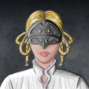
I like these portraits, they have a lot of character. It seems you have a strong understanding of facial proportion and a good eye and mind for characterizing portraits. By that I mean, that it's clear and easy to understand what kind of person they are, like a warrior, or a pirate. Though, on that note, some of the designs are a little simplistic and cliché, but that's part of what makes them so recognizable. I think finding a happy medium between the expected and your own designs is the strongest - in my opinion.
I checked in photoshop, and I see that you are using monotone shading throughout your portraits. That is, you pick a base tone for the skin, and then you simply make it lighter to highlight it. Brining it closer to white. If you look at your hand under a yellow light, and look closely, you'll see that the colors are warmer closest to the light, and the shadows, will in fact, be almost the color's compliment. Something cooler, like a purple or blue. And then there may be reflected atmospheric light from the sun shning through your window, and this too, will change the colors. It's these accurate representations of color that give us our strongest sense of the 3d form.
I do realize you're going for a cartoony approach, but the way you're using colors is giving the portraits a fairly bland feeling (an error partially made by the Devs as well, who used very white highlights in their portraits, though skintone is varied), and giving their skin a more plastic feel than living flesh. Even an extreme simplification of this principal can be applied to your works; using the same amount of highlights and shadows, but varying their colors slightly. This is in general, cooler colors than midtones, and then again the highlights should desaturate a little, giving them a cooler feel than the midtones as well.
I also think you're starying to the light side with shadows, and relying on line to establish the forms. This is one approach, but it does flatten out the characters. If you want them flat, that's fine, but if you did want them to pop I would recommend darking the shadows and really checking all of your values in grayscale to see if everything reads.
A good free tutorial covering these subjects in more depth is this one:
http://www.itchstudios.com/psg/art_tut.htm, and the best and most complete book I own covering it in great detail is James Gourney's
Color & Light.
That said, I hope you don't take my critique too harshly, as I'm trying to offer geniune help towards improving your works. I find these very creative. I think you should keep doing them, as they're even inspiring me for new ideas about races. Keep up the good work.

