The one complaint.

Re: The one complaint.
Note that the same logic applies all the way to the interface, not just attack buttons: Left-Click: Equip/Pick Up, Right-Click: Open Container, Eat Food, Drink Potion, Attack With Weapon, Cast Spell. Swapping left/right click for attack buttons would make the interface inconsistent. For example, moving an item from inventory to hand would be: left click to pickup, right click to put it into hand. We actually tried it and it didn't feel good at all.
Re: The one complaint.
It took some getting used to, but I like the controls as are, just hard without a good mouse. Has anyone tried a track ball mouse? Seems like that would be a different experience altogether.
Re: The one complaint.
I too prefer the Dungeon Master interface with regard to casting.
With DM there's no need to right click to open up the runes and obscure the hands/attacks to do so. I also like that the hands were independent of the attack buttons.
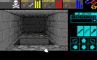
Lastly, with the consistent row of attack buttons in DM, it was much easier to maintain my view on the center of the screen with the monster and enjoy the animations. With Grimrock, I find that I don't get to enjoy that aspect as much as I'm constantly staring at the little hands/icons to make sure I click on them in the grid pattern vs just a nice wide row of buttons where I could just about slide the mouse around without looking (no vertical component and large). Grimrock draws my eyes away from the action and beautiful animations while I stare at the lower right corner which is unfortunate.
With DM there's no need to right click to open up the runes and obscure the hands/attacks to do so. I also like that the hands were independent of the attack buttons.
Lastly, with the consistent row of attack buttons in DM, it was much easier to maintain my view on the center of the screen with the monster and enjoy the animations. With Grimrock, I find that I don't get to enjoy that aspect as much as I'm constantly staring at the little hands/icons to make sure I click on them in the grid pattern vs just a nice wide row of buttons where I could just about slide the mouse around without looking (no vertical component and large). Grimrock draws my eyes away from the action and beautiful animations while I stare at the lower right corner which is unfortunate.
Re: The one complaint.
This is pretty much what I registered to say, cookie for youHowler wrote:Lastly, with the consistent row of attack buttons in DM, it was much easier to maintain my view on the center of the screen with the monster and enjoy the animations. With Grimrock, I find that I don't get to enjoy that aspect as much as I'm constantly staring at the little hands/icons to make sure I click on them in the grid pattern vs just a nice wide row of buttons where I could just about slide the mouse around without looking (no vertical component and large). Grimrock draws my eyes away from the action and beautiful animations while I stare at the lower right corner which is unfortunate.
Re: The one complaint.
I keep left-clicking by accident personally, it's annoying.

Re: The one complaint.
All I can really say is that keybindings would nicely do the trick to fix this.Howler wrote: Lastly, with the consistent row of attack buttons in DM, it was much easier to maintain my view on the center of the screen with the monster and enjoy the animations. With Grimrock, I find that I don't get to enjoy that aspect as much as I'm constantly staring at the little hands/icons to make sure I click on them in the grid pattern vs just a nice wide row of buttons where I could just about slide the mouse around without looking (no vertical component and large). Grimrock draws my eyes away from the action and beautiful animations while I stare at the lower right corner which is unfortunate.
This is what I suggested a couple of days ago (the subject keeps resurfacing!):
Mameluk wrote:Why not have the current frames, spread out horizontally at the bottom (or top!), as middle as possible, for the most neutral and eye-pleasing approach possible. So the frames wouldn't be awkwardly 'stacked' on one side of the screen.
With this, you could also change the controls to where you select a party member by pressing 1, 2, 3 or 4, and execute attacks and commands by clicking anywhere on the screen with left/right mousebutton or by pressing a keybind.

Re: The one complaint.
Exactly, love it and that is where I am from... Beholder series...boooyah!Goffmog wrote:It's similar to Eye of the Beholder, I guess, where you had to click on the spellbook or holy symbol, then pick the spell.
Anyway, enough of this foruming, back to the dungeon
Im up a perpetual estuary without the proper means of propulsion...
Re: The one complaint.
I find the magic system just fine. My one complaint is that combat is usually boring ol door hugging. Hit enemy, close door, open door, hit enemy. Repeat over and over. Everything hits so hard, you have so little place to move around and resources are almost non existent.
Feels cheesy to fight this way, but I feel the game is forcing me to.
Feels cheesy to fight this way, but I feel the game is forcing me to.
Re: The one complaint.
I'm not sure what would be best for the UI. DM's UI has some flaws too, but having keybinds for attacks could be nice. Casting with the numpad, as I've seen others mention, is an interesting idea. Anyway, minus the on screen arrow buttons for movement I think I like Dungeon Master's UI and controls better so far than Grimrock. I'll think about it some more after I've finished the game.Mameluk wrote: All I can really say is that keybindings would nicely do the trick to fix this.
This is what I suggested a couple of days ago (the subject keeps resurfacing!):Mameluk wrote:Why not have the current frames, spread out horizontally at the bottom (or top!), as middle as possible, for the most neutral and eye-pleasing approach possible. So the frames wouldn't be awkwardly 'stacked' on one side of the screen.
With this, you could also change the controls to where you select a party member by pressing 1, 2, 3 or 4, and execute attacks and commands by clicking anywhere on the screen with left/right mousebutton or by pressing a keybind.

Re: The one complaint.
Both left and right click select runes in the magic window and can activate the cast button. This is counter to the rest of the UI. Why is there an on screen cast button at all? Why not limit inputting runes to the left button and activate/use in game with the right? Just like everywhere else. The current system is confusing and often results in accidentally adding runes while hunting for the cast button.petri wrote:Note that the same logic applies all the way to the interface, not just attack buttons: Left-Click: Equip/Pick Up, Right-Click: Open Container, Eat Food, Drink Potion, Attack With Weapon, Cast Spell. Swapping left/right click for attack buttons would make the interface inconsistent. For example, moving an item from inventory to hand would be: left click to pickup, right click to put it into hand. We actually tried it and it didn't feel good at all.